

How To Create Google Sheets Dashboard
You're probably familiar with using Google Sheets to organize and analyze your data. But did you know you can build a dynamic Google Sheets dashboard to really understand your data?
With a handful of powerful techniques, you can add some pizzazz and dynamism to the presentation of your data. Here are ten tricks to try next time you're building a Google Sheets dashboard.
Contents
- Collect user inputs through a Google Form into a Google Sheets dashboard
- Retrieve data with LOOKUP formulas
- Apply logic with conditional formulas
- Automate your dates
- Add interactivity with data validation
- Chart your data
- Show trends with sparklines
- Apply conditional formatting to show changes
- Format like a pro!
- Share and publish your dashboard for the world to see
1. Collect user inputs through a Google Form into a Google Sheets dashboard
Google Forms are a quick and easy way to collect data. The responses are collected in a Google Sheet which we can then use to power a dashboard. For example, you could run a survey on customer satisfaction, or status reports from your operations team members, and then turn this data into a one page visual summary, giving you instant insight into your data. Let's run through a super quick and simple example:
Step 1: Create a Google form
Create a Google form in Google Drive (detailed instructions here) by navigating to:
Drive > New > More > Google Forms
Step 2: Setup the form
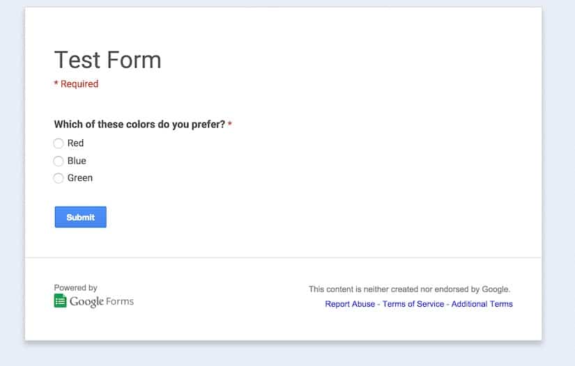
Next, setup your Google Form by giving it a name and adding any questions that you have. In this example, I've created a form with one multiple choice question which asks a user which color they prefer (from red, blue or green):
Step 3: Create the Google Sheets dashboard
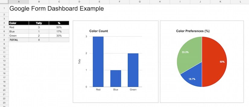
View your responses and setup the Google Sheets dashboard. You'll need to submit the form at least once, so that you have some data in your responses which you can use. I then added a new tab and created a new table (a staging table), which uses a countif formula (see section 3 on conditional formulas below) to tally up the votes for each color and show this count in the staging table. Then I added a bar chart and pie chart (see section 6 on charts below) running off this staging table to display the counts visually. These charts will update whenever new votes are submitted.
2. Retrieve data with LOOKUP formulas
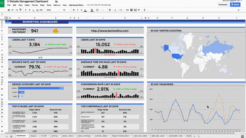
Mastering lookup formulas is a key technique for many data projects in Google Sheets (and Excel). It's at the heart of the Google Sheets dashboard shown at the start of this post and such a useful technique in it's own right that I'd recommend investing time to practice this technique. There are several methods at your disposal:
VLOOKUP is a vertical lookup formula which searches the first column of a range, and when it finds the first instance of the result (if there is one), it returns the value in that row from the column of the range that you specify with the index value, e.g.:
=VLOOKUP(F1,A1:D20,4,FALSE)
This formula takes the search term in cell F1, for example a string "Channel A", and looks for it in column A. At the first match, if it exists, (e.g. imagine cell A10 contains "Channel A") it returns the value corresponding to column 4 of that same row (in this case D10, which might be a sales figure for Channel A). Searching through numeric or dates in your lookup column (the first column) requires the data to be sorted to avoid incorrect values being returned.
HLOOKUP is a horizontal lookup implementation of the vlookup formula. I find it's rarely used but useful to keep in the back pocket for certain specific situations.
INDEX & MATCH are two formulas that combine together to create powerful, flexible lookup solutions. They are superior to vlookups by being more flexible and avoiding some of the pitfalls with vlookups (check out these articles here, here and here – they're Excel based but still apply to Google Sheets). However, they are a little more complex to implement as they involve two nested formulas.
To create the same implementation as we had above with the vlookup, we could use this formula:
=INDEX(A1:D20,MATCH(F1,A1:A20,0),4)
Multi-condition lookup formula: Sometimes a simple lookup formula isn't enough. For example, you may need to find a result based on two or more parameters (e.g. web traffic from a specific channel in a specific month). In this case, a multi-condition lookup formula can do the trick.
Say we have this table of Google Analytics data and need to retrieve the number of Search results in January 2015 (i.e. our answer is dependent on three criteria):
| A | B | C | D | |
| 1 | ga:year | ga:month | ga:channel | ga:sessions |
| 2 | 2015 | Jan | Search | 46,936 |
| 3 | 2015 | Jan | 922 | |
| 4 | 2015 | Jan | Referral | 4,973 |
| 5 | 2015 | Feb | Search | 43,302 |
| 6 | … |
Let's assume we have setup a staging table for our charts below this. To lookup the value we want (in this case Search for Jan 2015):
| 9 | … | |||
| 10 | Year | Month | Search | |
| 11 | 2015 | Jan | Formula? | |
| 12 | 2015 | Feb | Formula? |
we can use this formula in cell C11:
=INDEX($D$2:$D$9,MATCH($A11&$B11&C$10,$A$2:$A$9&$B$2:$B$9&$C$2:$C$9,0))
which gives a result of 46,936.
Crazy huh! This formula was inspired by this post from Excel wizard Chandoo, and uses an index/match lookup to compare multiple values across multiple columns in a data table. It concatenates the year, month and channel, to use as the lookup value, then looks for this concatenated value in the raw data across the year, month and channel columns. When it finds the right match it returns the corresponding result.
3. Apply logic with conditional formulas
COUNTIF is a formula which counts items in a range that match the specified criterion. It's useful for doing things like counting non-blank cells in a range or counting the number of specific items in a range. The formula is:
=COUNTIF(range, criterion)
COUNTIFS is similar to the countif formula but returns a result based on multiple criteria. In other words, it counts the number of items in the first range that matches the first criteria AND also match a second criteria in a second range AND a third etc… The formula is slightly different to the basic countif formula, as follows:
=COUNTIFS(range1, criterion1, [range2, criterion2, ...])
SUMIF is the same idea as the countif, but returns a sum of the values. It's possible to match criteria in one range, but sum values in a separate range, which is a really useful feature (e.g. imagine a table with names in column A and sales results in column B, then the sumif formula can sum the sales values for all occurrences of say "Ben" from the list of names). The formula for sumif is:
=SUMIF(range, criterion, [sum_range])
SUMIFS is the multi-criteria version of sumif, so it's the same idea but the sum is calculated when you match multiple criteria in multiple ranges. Again, a very useful formula:
=SUMIFS(sum_range, range1, criterion1, [range2, criterion2, ...])
4. Automate your dates
Dashboards often have a date component to them, where a variable changes over time and merits being illustrated visually in the dashboard. There are various formulas/techniques available for automating this process.
The today formula, which gives the current date, will display the date the last time the spreadsheet was recalculated (for example, when you open it or make a change). The formula is:
=TODAY()
If you want to also have a current time element in your spreadsheet, then use the now formula, which returns the date and time the spreadsheet was last recalculated. The formula is:
=NOW()
Both the today and now functions can be set to update automatically, rather than just when the sheet is recalculated. Go to File > Spreadsheet Settings and then select "On change and every hour" or "On change and every minute".
Be careful of inserting too many of these formulas in your spreadsheets as they are volatile functions, which means all that recalculating will harm your spreadsheet performance.
An example of using the today formula would be to display the current month in your dashboard, using the following text formula:
=TEXT(TODAY(),"MMMM")
For a more complex example, think of setting up start and end dates for a dashboard table, where I could enter formulas using the today function, set it to update automatically, and then base the other dates off that, using formulas.
The eomonth formula comes in handy here, returning the last day of a month which falls a specified number of months before or after another date.
For example, use the following formula to create the first day of the month prior to the current one:
=EOMONTH( TODAY(), -2 ) + 1
I could then keep "rolling" the months back, by changing the "-2″ to "-3″ for two months prior, then "-4″, "-5″ all the way back to "-13″, to give the current month plus 12 preceding months in a table, which would automatically update as we move into each new month.
I could also get the first day of the current month but a year earlier, for example to compare current sales metrics against the same period last year, using the following formula:
=EOMONTH( TODAY(), -13 ) + 1
See also:
> How do I get the first and last days of the current month?
> How do I get the first and last days of the prior month?
There are many possible variations from combining today, date, text and eomoth formulas, to get the correct periods you want in your Google Sheets dashboard and have them update automatically to stay current.
5. Add interactivity with data validation
Use data validation to add interactivity to your dashboards. You can create a nifty drop-down menu from which the user can select a parameter, e.g. a sales channel or specific time, and then change the data based on this choice, so any charts will update automatically. It's a pretty simple technique but surprisingly powerful.
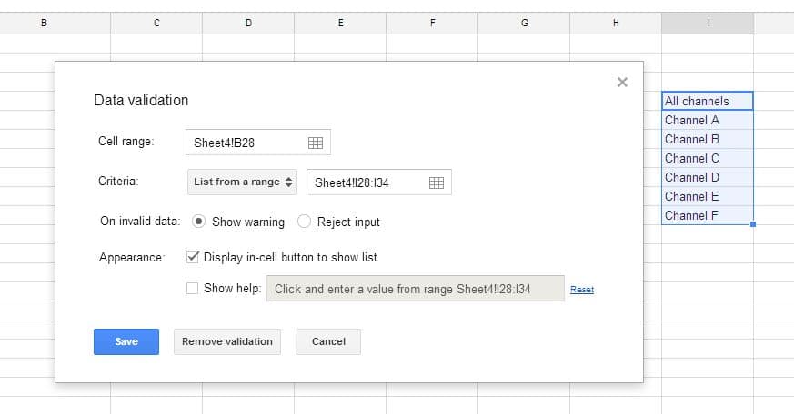
First, create a list of choices to present to the user, e.g. list of sales channels, and then using the Data > Validation feature on the highlighted list of values, create a user input menu for sales channels:
The user then has a drop down menu in your spreadsheet, from which he/she can select the desired parameter:
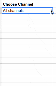
Data in the table which underpins a chart is changed based on the user's choice from the drop-down menu above, by using one of the lookup formulas from step 2.
Further reading: Check out this article and YouTube video on how to use data validation to create dynamic charts.
6. Chart your data
Google has a whole suite of charts available to use with your data. Some of the most well known are the plain old bar/column chart, the much-maligned pie chart (for and against arguments. Personally, I think judicious use is ok), line charts and scatter plots. In addition though, Google Sheets has the ability to create map charts, interactive time series charts, gauges (can be useful if used judiciously) or combined "combo" charts, which allow you to combine different data series visualizations.
Examples
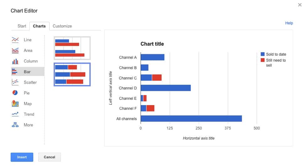
The humble bar chart can be tweaked into a stacked bar chart, which can be used to visualize two related metrics, for example how many sales have been made so far, versus how many are still required to hit the target.
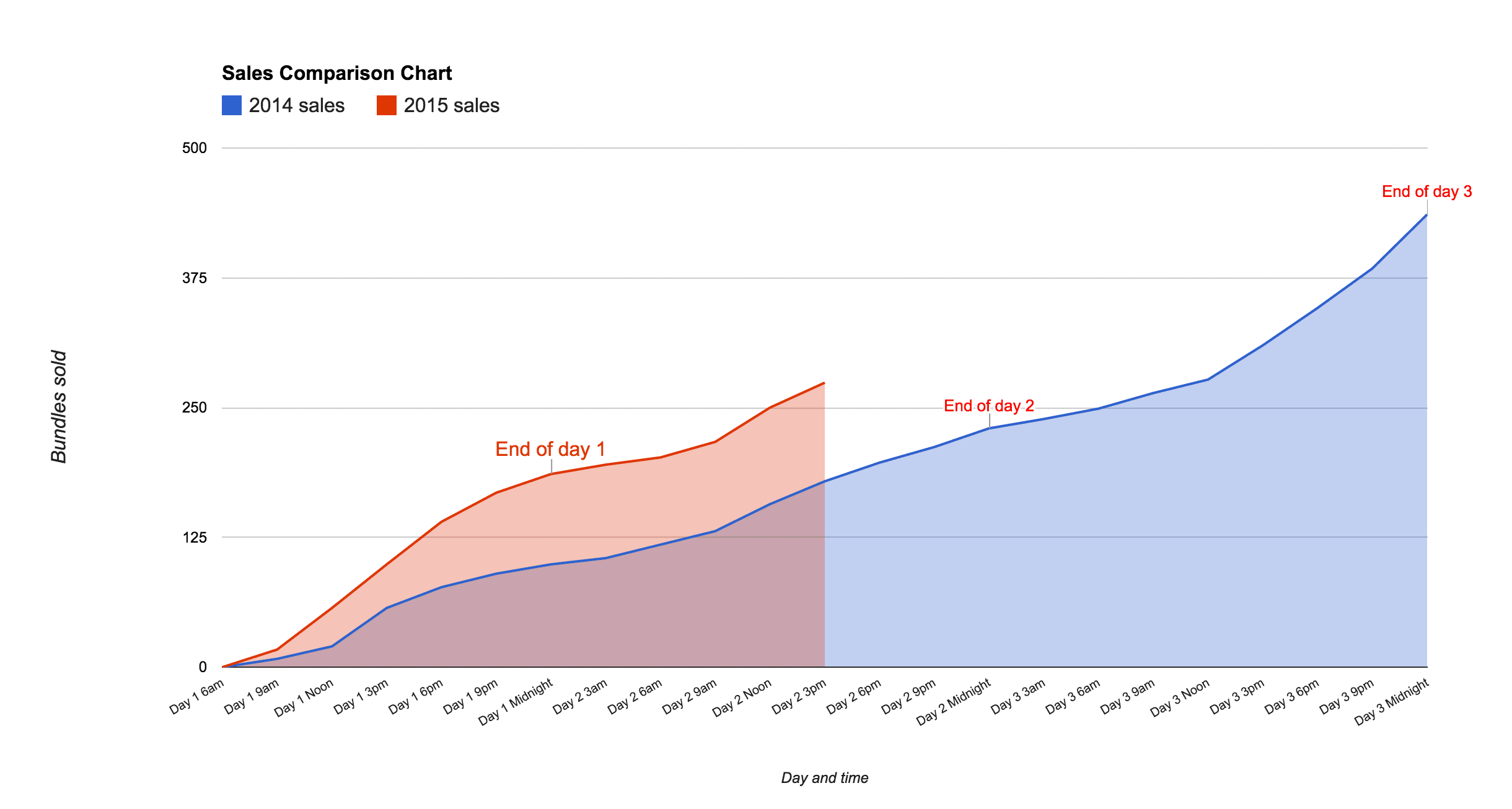
An area chart can be used to show comparisons of data, as shown in this example of the cumulative sales during a digital flash sale, showing 2014 data against 2015 data:
More info on setting up charts in the official docs here.
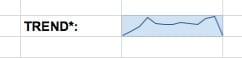
7. Show trends with sparklines
Sparklines were first created by statistician and data visualization legend Edward Tufte. They're small, simple charts without axes, which exist inside a single cell. They're a wonderful, quick way for visually showing a result, without needing the complexity of a full-blown chart. They work well for datasets based on a timescale.
A sparkline looks like this:
The formula for sparklines in Google Sheets is:
=sparkline(data,[options])
where data refers to a range of values to plot the sparkline. The optional options argument is used to specify things like chart type (line, bar, column or winloss), color and other specific settings.
Further reading: Everything you need to know about sparklines in Google Sheets
8. Apply conditional formatting to show changes
Hidden in the Custom Number Format menu is a conditional formatting option for setting different formats for numbers greater than 0, equal to 0 or less than zero.
It's a great tool to apply to tables in your Google Sheets dashboards for example, where the data is changing. By changing the color of a table cell's text as the data changes, you can bring it to the attention of your user.
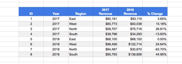
Consider the following sales table which has a % change column:
Now take a look at the same table with colors and arrows added to call out the % change column:
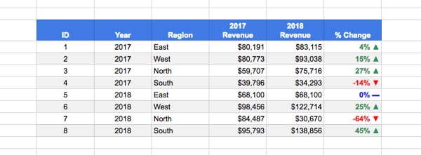
It's significantly easier/quicker to read and absorb that information.
How to add this custom formatting
1. Somewhere in your Sheet, or a new blank Sheet, copy these three CHAR formulas (you can delete them later):
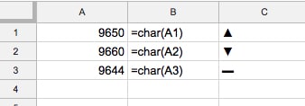
=char(A1)
=char(A2)
=char(A3)
Now, copy and paste them as values in your Sheet so they look like column C and are not formulas any longer.
(You copy as values by copying, then right clicking into a cell and select Paste special > Paste values only…)
You'll need to copy these to your clipboard so you can paste them into the custom number format tool.
2. Highlight the % column and go to the custom number formatting menu:
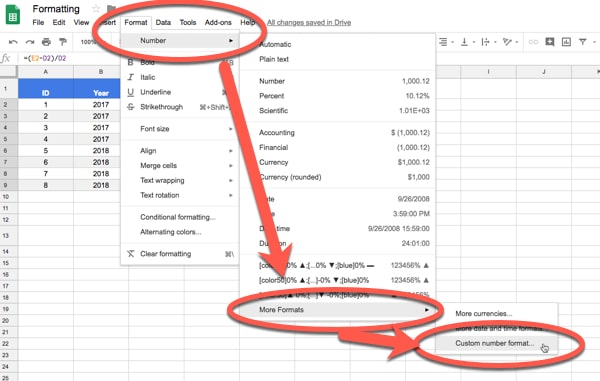
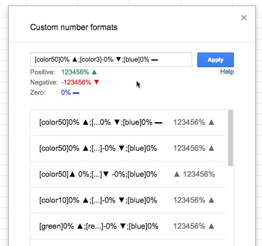
3. Change the 0.00% in the Custom number formats input box to this:
[color50]0% ▲;[color3]-0% ▼;[blue]0% ▬
as shown in this image:
What you're doing is specifying a number format for positive numbers first, then negative numbers and then zero values, each separated by a semi-colon.
Copy in the symbols from step 1 (you'll have to do this separately for each one).
Use the square brackets to specify the color you want e.g. [color50] for green.
Read more about custom number formatting here: Excel custom number formats
(Yes, it's an Excel article, but the rules are the same.)
9. Format like a pro!
After all that effort to tease out the real stories hidden in your data, and make them accessible in charts and tables, it's worth a little effort to spruce up the final version. Consider some of these ideas:
- Change the color of charts in your Google Sheets dashboard to match your brand
- Give all the tables a consistent format, e.g. light gray borders, a bold header row with white text and alternate gray/white shaded rows
- Remove the gridlines. Find this option in the View menu:
View > Gridlines - Add your logo to the top of the dashboard
- Hide all working tabs except the dashboard tab (does not affect the functionality of the dashboard)
- Use freeze panes, to lock specific rows or columns, so that if a user scrolls the header row(s) will be locked in place for example, and the title and user input options will always be visible. It's found in the View menu:
View > Freeze - View the dashboard in full screen mode
10. Share and publish your Google Sheets dashboard for the world to see
It's quite likely you'll want to share your dashboard with colleagues, clients and/or the world. There are a couple of ways of doing this.
Firstly, you can click the Share button in the top right corner of the screen, which opens up the sharing options pane:
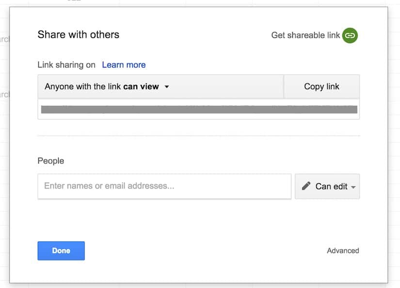
From here, you can enter email addresses to share directly with colleagues, or you can grab the sharing url and email that to people you want to share with, or paste into social media channels.
You have control over the access rights and whether recipients of the link can view, comment on or edit the dashboard. More information on the sharing settings in Google sheets here.
Secondly, you can publish your Google Sheets dashboard as a web page, or embed it as a component in another page, by clicking on:
File > Publish to the web...
which brings up this pane of options:
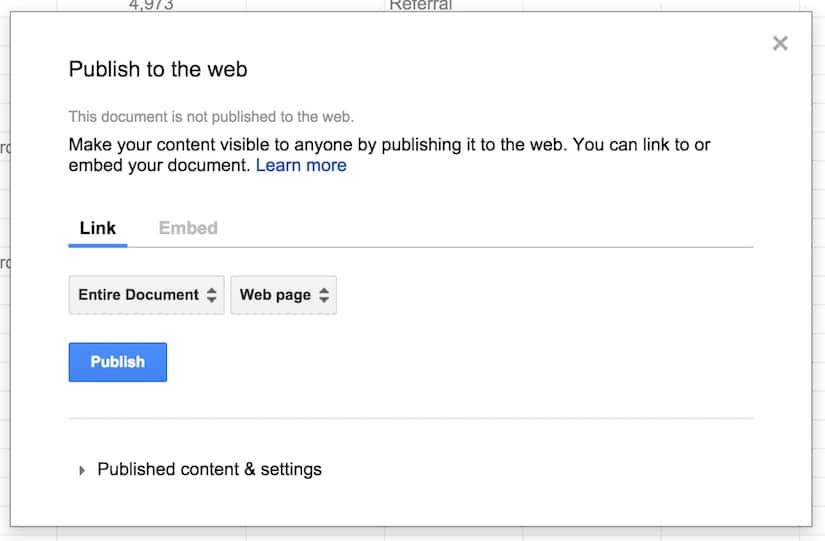
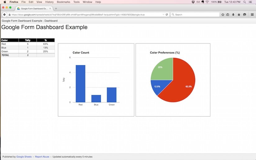
Publishing this way makes the Google Sheets dashboard visible to the public. For example, here is the Color Picker Form dashboard example from section 1 of this post, published online as a web app:
Grab the Google Sheet template for this Google Sheets Dashboard tutorial, with all 10 examples!!
Click here to get your own copy >>
Thoughts or comments? Do you have a favorite technique or formula for dashboards? Leave your ideas below!
How To Create Google Sheets Dashboard
Source: https://www.benlcollins.com/spreadsheets/10-techniques-google-sheets-dashboard/
Posted by: mooreforgerd.blogspot.com
0 Response to "How To Create Google Sheets Dashboard"
Post a Comment